The Power of Nostalgia in Grocery Brand Packaging Success
You know what’s kind of funny about the grocery store? In a world that’s obsessed with the next big thing, some of the most successful products aren’t really selling innovation or even the best price. They’re selling a feeling—a memory. These are the brands whose packaging looks almost exactly like it did when you were a kid. That bright Jell-O box, that classic soup can… they aren’t just containers; they’re time machines. In a market constantly screaming “New and Improved!”, these brands prove that sometimes, feeling familiar is the most powerful tool of all.
Pepsi: The Master of the Throwback Vibe
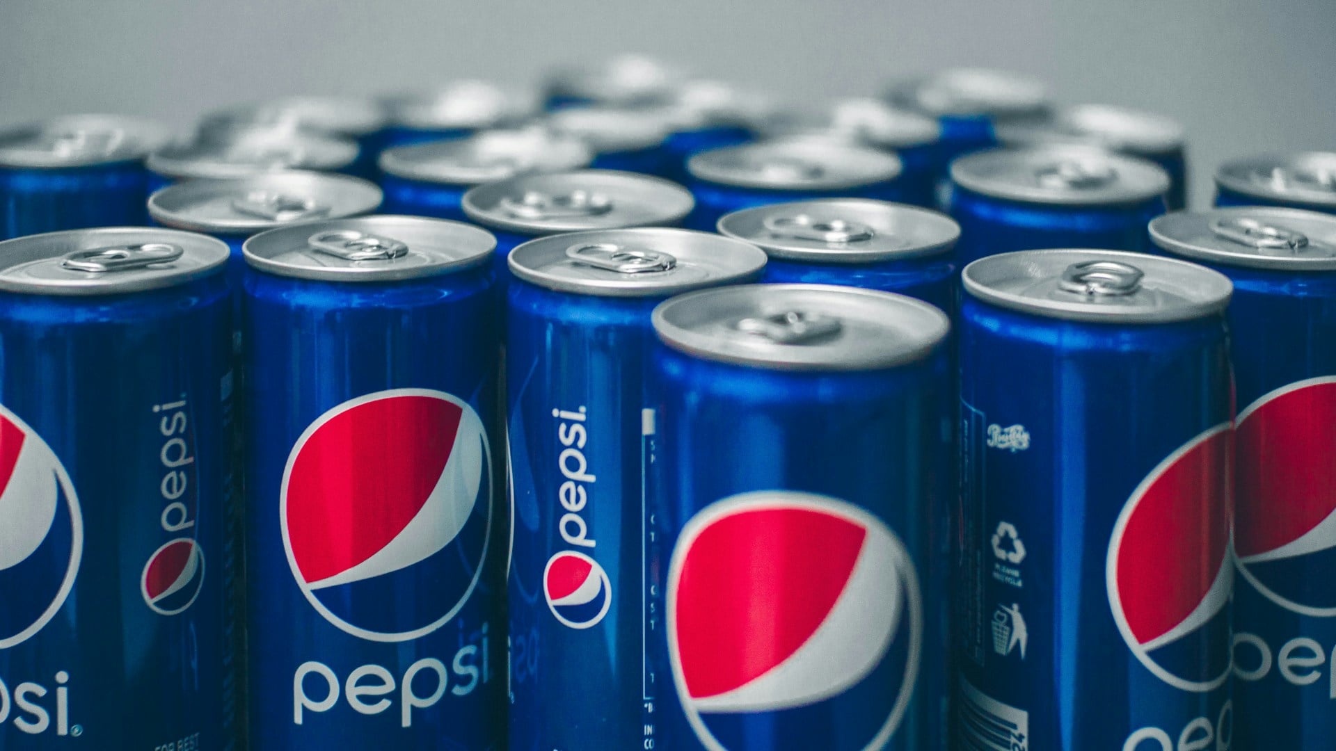
Pepsi’s regular branding gets updates, but its real magic happens with throwback cans. When they bring back a classic logo from the ’80s or ’90s, it’s not just a design choice—it’s an emotion. Those vintage fonts and color blocks aren’t about tasting different; they’re about feeling different. They tap straight into memories of summer parties, road trips, and pop culture moments. Even if you didn’t live through the era it references, the design feels authentic and cool. It tells a story of heritage and fun in a way a sleek, modern can never quite match.
Campbell’s Soup: The Comfort Food Uniform
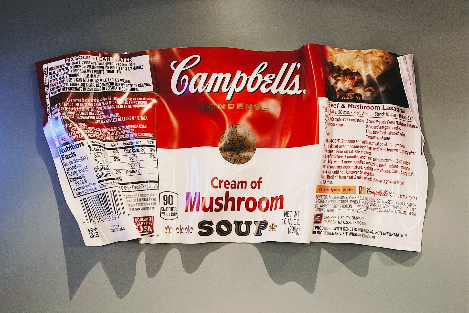
The Campbell’s soup can is practically a piece of American shorthand. That red-and-white label is so iconic, it barely needs words. It doesn’t try to be trendy or artisanal; it promises one thing: reliable comfort. In a stressful week, you don’t want a surprise; you want a can of tomato soup that tastes exactly like it did when you were home sick from school. While other brands use photos of steam bowls, Campbell’s just stays… Campbell’s. That stubborn consistency is its greatest strength, making it the go-to solution for a quick, warm meal.
Borden Dairy: Mascot Magic That Lasts

Borden’s secret weapon is Elsie the Cow. In an era of minimalist branding, this cheerful, mid-century mascot is a blast of wholesome nostalgia. She doesn’t look modern, and that’s exactly why she works. Elsie taps directly into childhood memories of milk cartons at school lunch, projecting an image of trust and simple goodness. In a category where you really want to feel good about what you’re buying, that friendly, familiar face does more heavy lifting than any list of health claims ever could.
So next time you’re in the store, take a look around. The brands that seem to live forever often do it not by constantly changing, but by lovingly staying the same, reminding us of simpler times with every familiar label and logo.
Jell-O: The Wobbly, Wonderful Time Capsule

Let’s be real: nobody wakes up with a deep craving for gelatin. They wake up with a craving for nostalgia. And that’s Jell-O’s superpower. The bold, slightly retro look of the box hasn’t really changed, and that’s the point. It instantly whisks you back to family potlucks, weird-but-wonderful holiday salads, and simple childhood desserts. While other snacks compete on protein content or probiotics, Jell-O confidently stays the same. That familiar package whispers, “Remember this? It’s still just as fun.” In a sea of complicated choices, that simple, joyful recognition is why it never really goes away.
Heinz Ketchup: The Quietly Confident Classic

Heinz is the king of subtle, powerful nostalgia. The glass bottle shape, the distinctive label, the specific shade of red—they’ve barely budged in decades. It doesn’t need to scream for attention because it’s already the default in most people’s minds. It’s the ketchup from backyard barbecues and diner tables. That deep-seated familiarity creates a trust that fancy organic or flavored ketchups have to work hard to break. The packaging quietly says, “This is the real deal,” and for millions, that’s all the convincing they need.
Hershey’s: The Straightforward Sweet Staple
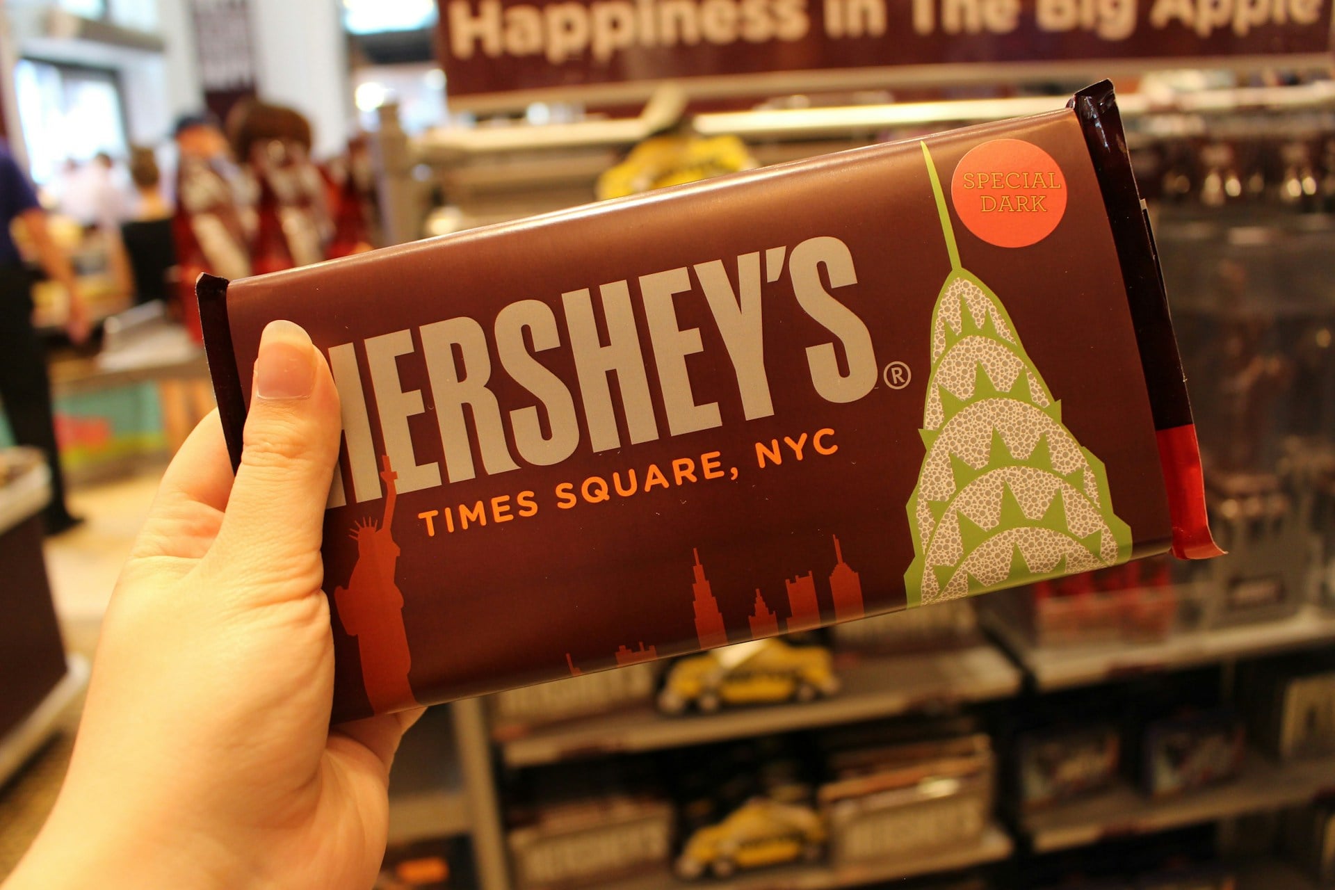
In a world of fancy, single-origin chocolate bars with intricate flavor notes, Hershey’s keeps it brilliantly simple. That plain brown wrapper with the bold logo is a beacon of no-fuss satisfaction. It doesn’t promise a gourmet experience; it promises the exact chocolate bar you’ve always known for s’mores, baking, or a quick treat. The packaging hasn’t changed because the feeling it evokes shouldn’t change. It’s comfort food in its simplest, most reliable form, and that consistent, familiar look is a huge part of its enduring appeal.
Kellogg’s Corn Flakes: The Breakfast Anchor
Amidst cereal aisles exploding with neon colors and cartoon mascots, the Corn Flakes box is an island of calm. The proud rooster, the simple red script—it looks like breakfast should look. It doesn’t chase wild flavors; it offers predictability and a touch of tradition. Parents see the box they grew up with, and it feels like a safe, sensible choice. In a chaotic morning, that visual promise of a simple, no-surprises start to the day is incredibly powerful.
Betty Crocker: The Trusted Kitchen Helper

Betty Crocker’s packaging is like a friendly nod from your mom’s kitchen. The red spoon logo and classic design don’t say “cutting-edge”; they say “tried and true.” For someone who’s nervous about baking, that box is a lifeline. It whispers, “Don’t worry, I’ve got you. This will work.” In the age of Instagram-perfect baking fails, Betty Crocker feels approachable and dependable. The familiar look is a shortcut to confidence, promising that your cake will turn out just fine, just like it has for generations.